How to Design a Professional Brochure Using Pages: Step-by-Step Guide
Create a professional brochure using Pages with step-by-step guidance on layout, text, images, and design tips for a polished final product.
You have a great product or service and want to create an eye-catching brochure to share your message. Maybe you don’t have access to professional design software but have a Mac with the Pages app installed.
This article covers how to design a brochure in Pages by guiding you through each step, from setting up your document to adding text and images, then arranging everything for a polished look. Along the way, you’ll learn practical tips to make design choices that keep your readers engaged and ensure your brochure communicates effectively.
Key takeaways
- Start by defining your brochure’s purpose and gathering all necessary content before opening Pages.
- Use Pages’ preset document sizes or create a custom page layout matching your brochure format.
- Format text with clear headings and consistent styles to improve readability.
- Insert high-quality images and resize them using the Arrange tab for better layout control.
- Review your design carefully on-screen and in print preview to catch alignment or spacing issues.
Before you start: Gather your materials and define your brochure’s purpose
Beginning your brochure project means being clear about its purpose. Knowing whether your brochure aims to inform, promote, or educate will guide your choices in content arrangement and design style. For example, a promotional brochure might prioritize bold images and clear calls to action, while an educational brochure will focus more on organized text and informative graphics.
Next, collect all the materials you need before opening Pages. This includes your written content such as headlines, descriptions, and contact information, as well as logos, photos, and any other visuals. Having these ready ensures a smooth workflow without interruptions.
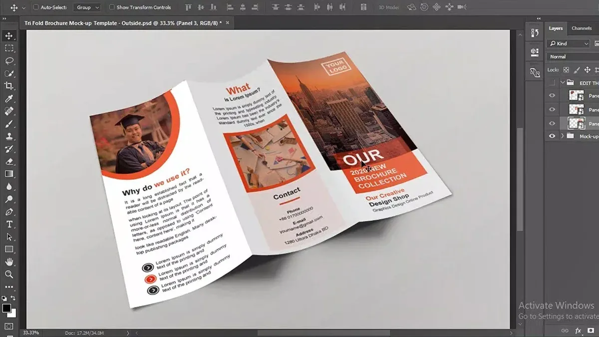
Decide on the brochure’s size and fold type early on. Common options include bi-fold (two panels) and tri-fold (three panels), each affecting how you organize content and images. This decision affects the document setup in Pages and how readers will interact with your brochure.
Make sure you have access to Apple Pages on your Mac or iPad. This software provides the tools necessary to create your brochure without needing specialized design programs.
Finally, keep consistent branding and tone in mind. Choose colors, fonts, and language that align with your brand identity to create a professional and cohesive look. This consistency builds trust and makes your brochure more effective.
- Define your brochure’s main goal (inform, promote, educate). You should be able to describe the primary message your brochure will communicate.
- Gather all text elements, images, logos, and contact details. When complete, have these materials saved and organized in accessible folders.
- Choose the brochure size and fold type (bi-fold, tri-fold, etc.). Confirm this choice to prepare for document setup.
- Verify you have Apple Pages installed and ready to use on your Mac or iPad. Open the app to confirm it launches without issues.
- Review your brand colors, fonts, and tone guidelines to ensure you can apply them consistently throughout your brochure design.
Set up your brochure document in Pages
Starting your brochure with the right document setup in Pages ensures a smooth design process tailored to your brochure type. Whether you choose a tri-fold, bi-fold, or custom fold, the page size and orientation must match your intended print and fold style.
- Open Pages and create a new document. When the template chooser appears, you can either select a built-in template under the “Brochures” category or choose “Blank” to start from scratch. Templates provide a ready-made layout but may limit customization, while a blank document offers full control.
- Set the page size and orientation. Go to the Document sidebar on the right, then click Document tab. Under Page Setup, choose your paper size (commonly Letter 8.5" x 11" or A4). For most brochures, landscape orientation works well, especially for tri-folds.
- Configure margins and columns. Still in the Document tab, set margins to about 0.5 inches to allow for folding space. Then, under Layout, add columns matching your brochure folds—three columns for a tri-fold, two for a bi-fold. This helps you visually plan each panel.
- Create master pages or reusable layouts. While Pages does not have a dedicated master page feature like some design software, you can duplicate pages with set layouts and styles. Design one page with text boxes, image placeholders, and styles, then duplicate it to maintain consistency across your brochure.
- Enable grids and rulers for alignment. From the View menu, select Show Rulers and Show Layout Guides. Grids and guides snap objects into place, ensuring precise alignment and clean edges for your panels.
Choosing a template speeds up the setup with predefined styles, but starting blank offers flexibility to customize dimensions and layout exactly. Using columns aligned with your fold style and enabling rulers builds a strong structural base, making your brochure look professional and balanced.
Add and format text effectively for your brochure design
Adding and styling text in Pages is key to creating a clear and engaging brochure. Begin by inserting text boxes to position your content flexibly. To add a text box, click the Text button on the toolbar or go to Insert > Text Box. You can move and resize these boxes to fit your layout, giving you control over where your text appears.

Next, choose fonts that improve readability and fit your brochure’s tone. For example, pair a clean sans-serif font like Helvetica Neue for headings with a complementary serif like Georgia for body text. Headings typically look best around 18–24 pt, while body text should be 10–12 pt for easy reading. Avoid using more than two font families to keep the design cohesive.
Use Pages styles to maintain consistency across your brochure. Select your heading text, then click Format panel > Style > Create New Style to save your custom heading style. Repeat for body text and other recurring elements. Applying these styles lets you update fonts or colors everywhere at once, ensuring uniform formatting.
Pay attention to spacing and alignment to guide readers smoothly. Use the Format panel > Layout options to adjust line spacing to about 1.2 to 1.5 for body text. Align text left for readability, and use centered alignment sparingly for emphasis. Create a clear hierarchy by making headings bold and larger, and adding space above them.
Incorporate bullet points and numbered lists to break up dense information. Highlight your list text and click the Bullets & Lists button in the Format bar to apply. Use callouts or text boxes with background fill for important notes or quotes to draw attention. For example, a light gray fill with italic text can set off testimonials effectively.
- Insert a text box by clicking Text on the toolbar; move and resize it to your desired location. You should see a movable text container appear.
- Type or paste your content inside the box; adjust font to Georgia at 11 pt for body text via the Format > Text panel.
- Select a heading, change font to Helvetica Neue Bold at 20 pt, then create a new style by clicking Format > Style > Create New Style. Name it "Heading 1".
- Apply the "Heading 1" style to all headings to maintain consistent look; updating the style later will update all headings.
- Use the Format > Layout panel to set line spacing to 1.3 and choose left alignment; text should now look clean and easy to scan.
- Highlight important points and click Bullets & Lists to add bullet points; these will improve readability by organizing information clearly.
- Add a new text box for a callout, fill it with light gray from Style > Fill, and italicize the text to visually separate it from main content.
Insert and adjust images and graphics to enhance your brochure
Adding visuals that complement your text can make your brochure more engaging without overwhelming your layout. Begin by importing high-resolution images to ensure clarity when resized. To import, go to the Insert menu and select Choose, then locate your image file. After insertion, click the image and drag the corners to resize it proportionally; avoid stretching to maintain quality. If the image appears pixelated after resizing, try using a higher resolution version.
Use Pages’ built-in image editing tools to tailor visuals to your design. Select the image, then click the Format button and choose Image. From there, you can crop unwanted areas by dragging the image frame, or mask shapes to create custom image outlines. Adding shadows or reflections can make images stand out subtly; adjust these effects under the Style tab. For example, a soft shadow can help separate an image from a white background without adding clutter.
Balance images with text by aligning visuals near related content and leaving sufficient white space around them. A brochure page with too many images or oversized graphics can feel crowded and distract from your message. Instead, use one or two well-placed images per panel to support key points. Logos and icons reinforce branding—insert them as images and position them consistently on each page, often near headers or footers.
To keep costs low, consider sourcing royalty-free images from websites like Unsplash or Pixabay. These sites offer quality photos and icons suitable for commercial use without licensing fees. Always check image resolution and relevance before adding them to your brochure. By carefully selecting and adjusting your images, you create a polished, visually appealing brochure that communicates effectively.
Layout your brochure pages and create a cohesive design
Arranging your brochure’s text and images across panels is key to a professional, easy-to-navigate design. For bi-fold or tri-fold brochures, distribute content logically to guide the reader’s eye smoothly through your message. Pages' alignment guides and spacing tools help maintain clean, balanced layouts by snapping elements into place and ensuring consistent gaps.
Applying a consistent color scheme and background across panels unifies your design visually, reinforcing your brand identity or brochure theme. Consider how readers naturally scan from left to right and top to bottom, placing important information and calls to action where the eye lands first, such as the front panel or upper left areas.
- Divide your canvas into panels: Use the ruler guides to mark panel edges for a tri-fold brochure, typically three equal vertical sections. This setup helps visualize each panel’s content area.
- Arrange text and images within each panel: Position headings and key images near the top, supporting details below. When done correctly, each panel should look balanced with clear hierarchy.
- Use alignment guides: Enable “Show Alignment Guides” under the Arrange menu. Move objects until the pink snapping lines appear, ensuring edges and centers align across panels.
- Maintain consistent spacing: Use the Format sidebar’s Size & Position tab to set uniform margins and padding. Equal spacing between elements creates a tidy, professional look.
- Apply color schemes and backgrounds: Select consistent fill colors or subtle gradients in the Format sidebar for shapes or page backgrounds. This visually ties panels together without overwhelming content.
- Check reader flow: Preview the brochure by scrolling horizontally or printing a draft. Confirm the order and emphasis of content matches natural reading patterns and your brochure’s goals.
- Sample 4-page brochure layout: Page 1: front cover with title and image; Page 2: introduction and benefits; Page 3: detailed information and images; Page 4: contact info and call to action. Each page should visually connect using consistent fonts, colors, and alignment.
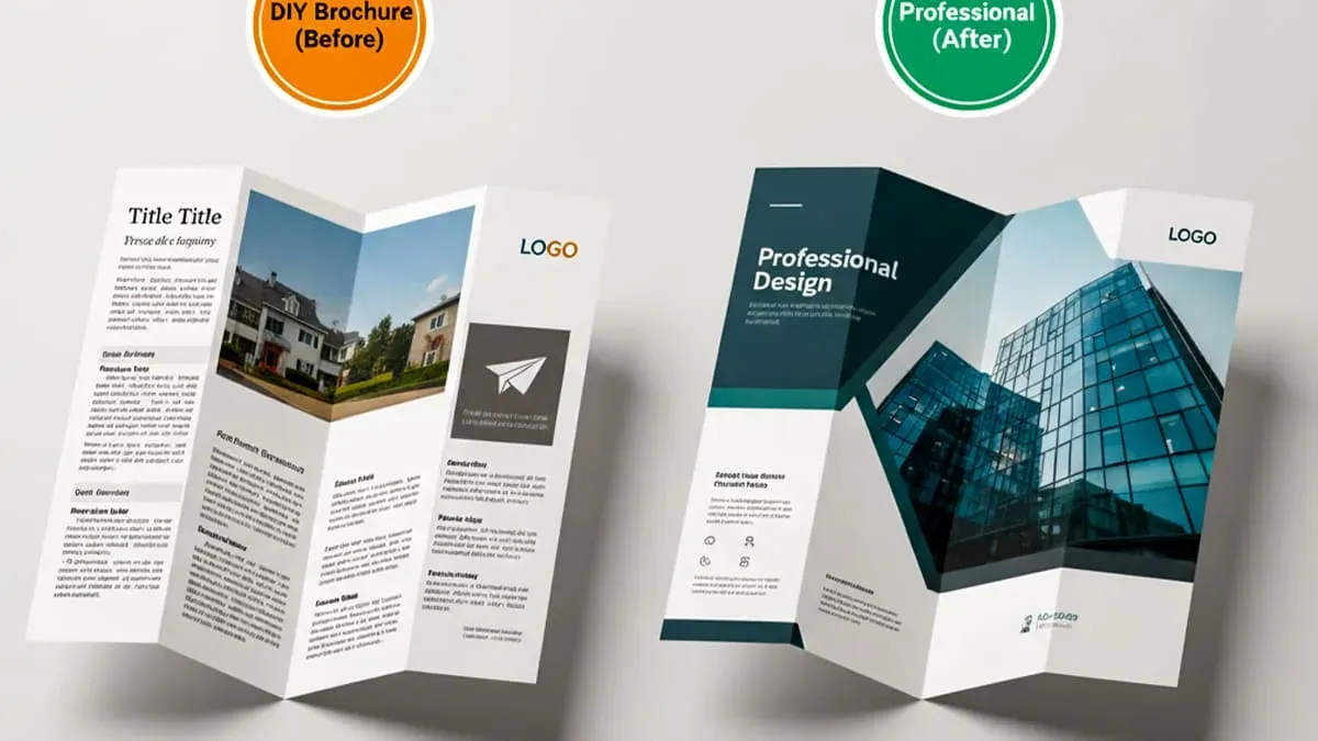
For example, side-by-side comparisons show how aligning images and text boxes along panel edges, rather than scattered placement, dramatically improves readability and professionalism. Similarly, using a single accent color across all panels strengthens design cohesion and brand recognition. Following these steps ensures your brochure communicates clearly and looks polished.
Review and refine your brochure design before printing or sharing
Before finalizing your brochure, carefully proofread all text for spelling, grammar, and factual accuracy. Use Pages’ built-in spell check and read aloud features to catch errors you might miss visually. Confirm that all phone numbers, URLs, and contact details are correct to maintain professionalism.
Next, check your images for print quality. Images should be at least 300 dpi to avoid pixelation when printed. Ensure colors are set to CMYK if you plan commercial printing; Pages defaults to RGB, so consulting your print provider about color specifications is helpful. Avoid low-resolution images that appear blurry or grainy.
Use Pages’ File > Export To > PDF option to create print-ready files. In the export dialog, select Best quality for images and tick Include Bleed if your design extends to the page edges. Bleed should extend 0.125 inches beyond the trim line to prevent white borders after cutting. Also, maintain safe zones by keeping important text and graphics at least 0.25 inches inside the trim edge.
If sharing digitally, export as PDF or JPEG with medium to high resolution to balance quality and file size. Check how the colors and fonts appear on multiple devices. Pages’ preview mode helps simulate how the layout looks without editing tools visible, so use it to catch layout issues or text overflow.
- Proofread all text using Pages spell check and read aloud; ensure no errors remain and contact info is accurate. You should see all spelling errors corrected and smooth, clear reading.
- Verify image resolution by selecting each image and checking the Inspector; confirm resolution is 300 dpi or higher. You should see crisp, clear images without pixelation.
- Set up bleed areas by extending background images or colors 0.125 inches beyond page edges. Your design should have color or images reaching beyond the trim line.
- Export your document via File > Export To > PDF, selecting "Best" quality and "Include Bleed". You will get a print-ready PDF suitable for professional printers.
- For digital sharing, export to PDF or JPEG at medium/high quality without bleed. Check the file on various devices to confirm appearance and readability.
- Use Pages preview mode (View > Show Preview) to review the brochure without distractions. The layout should appear clean and consistent with no overlapping text or images.
Troubleshoot common brochure design challenges in Pages
When designing brochures in Pages, you may face some common challenges that can disrupt your layout or visual appeal. Fixing these issues early helps keep your project on track and ensures a professional result.
Fix text overflow and unexpected line breaks
- Select the text box with overflow or awkward breaks. You should see a red plus sign or cut-off text at the bottom if overflow exists.
- Adjust the text box size by dragging its handles or use Format sidebar > Text > Layout to change inset margins. The overflow indicator should disappear once the box fits the text.
- Check for manual line breaks by clicking in the text and looking for unwanted returns. Removing these will allow natural text flow.
- Change the font size or line spacing under Format > Text if the text still doesn’t fit, aiming for balance between readability and space.
Resolve image distortion or pixelation problems
- Ensure you insert high-resolution images (at least 300 dpi) by using Insert > Choose.
- Avoid stretching images disproportionately; hold Shift while resizing to maintain aspect ratio. The image should remain sharp and undistorted.
- If the image appears pixelated, replace it with a higher-quality version or reduce its size in Pages rather than enlarging a small image.
Manage layout shifts when adding or removing content
- Use anchored objects by selecting an image or text box, then Format > Arrange > Object Placement > Fixed on Page. This prevents layout shifts when editing nearby content.
- Group related objects (select multiple, then Arrange > Group) so they move together and maintain your intended design.
- Regularly preview your brochure in Print Layout to catch any unexpected shifts before finalizing.
Deal with template limitations and customize effectively
Pages templates offer a starting point but can be restrictive. To customize:
- Unlock or delete placeholder elements not needed by selecting them and pressing Delete.
- Add new text boxes or shapes via Insert menu to tailor your layout.
- Modify styles through Format > Text > Styles to match your branding, but save custom styles for consistent formatting.
When Pages might not be sufficient and alternatives
Pages is great for straightforward brochure design, but complex layouts or advanced typography might require professional tools. If you need precision grids, advanced color management, or extensive vector graphic support, consider Adobe InDesign or Affinity Publisher. These programs offer more control but come with a steeper learning curve and cost.
In summary, understanding Pages’ quirks and workarounds lets you handle common brochure design problems effectively, but knowing when to switch tools ensures your final product meets professional standards.
Frequently asked questions
How to design a brochure in word?
In Word, start by choosing a brochure template via File > New and searching for "brochure." Set your page orientation to Landscape under Layout > Orientation. Use columns (Layout > Columns) to create panels, then insert text boxes and images using Insert > Text Box or Insert > Pictures. Adjust fonts and colors with the Home tab to keep your design consistent.
How to design a brochure for free?
You can design a brochure for free using apps like Apple Pages, Google Docs, or online tools like Canva. These platforms offer templates and drag-and-drop interfaces, allowing you to customize text, images, and layout without cost. Pages is especially handy if you want offline access and easy export to PDF.
How to create a brochure on paper?
To create a brochure on paper, start with a blank sheet sized like your final brochure, often 8.5x11 inches for tri-folds. Divide the page into equal panels using light pencil lines or a ruler, then sketch your text and images roughly. After planning, write and draw clearly or print a digital design, then fold the paper along the panel lines carefully to form the brochure.
How to do a brochure?
Doing a brochure involves defining your message and audience, choosing the brochure type (bi-fold, tri-fold, etc.), and setting up your document with appropriate page size and columns. Add clear headings, concise text, and relevant images to maintain reader interest. Finally, review the design for balance and readability before printing or sharing electronically.
How to create a brochure?
Creating a brochure starts with planning your content and purpose, then selecting a design tool like Pages or Word. Set up your page layout with columns to represent brochure panels. Insert and format your text and images thoughtfully, ensuring consistent fonts and clear visuals. Finish by checking alignment and spacing to produce a professional, engaging brochure.
What This Guide Does Not Cover
This guide focuses on Apple Pages, which is excellent for simple to moderately complex brochures but lacks advanced features found in professional design software like Adobe InDesign. If your brochure requires precise color management, complex multi-page layouts, or commercial print specifications such as bleeds and spot colors, specialized tools are more suitable. Additionally, Pages does not support professional prepress file formats like PDF/X, so for high-volume or commercial printing, consult a print professional or use dedicated design software.
For your next step, open Pages and start a new document using the "Brochure" template from the template chooser. This template provides preset panels and guides that help you visualize your layout from the start, making it easier to apply the design principles covered. Experiment with adding text boxes and images as you follow each step, and save your work frequently to avoid losing progress.
See also: How to Add Page Numbers in Pages: Step-by-Step for Mac, iPad, and iPhone · How to Add a Table of Contents in Pages: A Complete Step-by-Step Guide · How to Convert Pages to Word Documents Using Pages