
How to Make a Pie Chart in Numbers: A Clear Step-by-Step Guide
Discover clear steps to create and customize pie charts in Numbers for your reports and presentations.
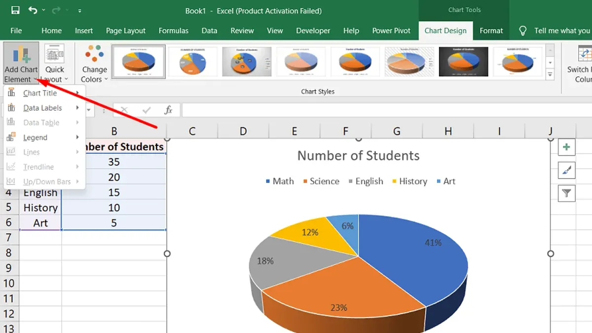
You're preparing a report or a presentation and need to show your data clearly and attractively. Using a pie chart can help your audience quickly grasp the proportions and relationships within your data. If you've wondered how to make a pie chart in Numbers, this guide will walk you through each step on your Mac, from setting up your data to customizing the chart.
This article covers everything you need to know about creating pie charts in Numbers, including working with both numeric and non-numeric data, making pie of pie charts, understanding the math behind the slices, and how to insert your chart into documents or presentations. You'll also find practical tips for using pie charts in math assignments and common troubleshooting advice.
Key takeaways
- Organize your data in a table with clear labels and numeric values before creating a pie chart.
- Use the Chart button in Numbers’ toolbar to select and insert a pie chart quickly.
- Customize slice colors and labels in the Format sidebar for clarity and impact.
- Create pie of pie charts by grouping smaller slices to enhance readability.
- Understand that each slice’s angle represents its proportion of the total sum of values.
Before you start: What you need to create a pie chart in Numbers
To create an effective pie chart in Numbers, you first need to have your data properly organized. This means arranging your information in columns or rows with clear labels that describe each category, alongside numeric values representing each part. For example, you might have a list of fruit types in one column and their quantities in the adjacent column, such as Apples - 40, Bananas - 25, Oranges - 35.
Next, ensure you have the latest version of Numbers installed on your Mac or iPad. Apple frequently updates Numbers to improve functionality and chart features. You can check for updates through the App Store under the Updates tab. Having the current version helps avoid bugs or missing chart options.
Before diving into chart creation, it helps to understand what pie charts represent: they show parts of a whole as slices of a circle. Use them when you want to visualize proportions or percentages clearly. If your data does not total a meaningful whole, a pie chart might not be the best choice.
- Open Numbers on your device. You should see the main interface with options to open or create a spreadsheet.
- Create a new blank spreadsheet or open an existing file containing your dataset. You should see a grid of cells arranged in columns (A, B, C) and rows (1, 2, 3).
- Enter or confirm your data is organized in two columns or rows: one for category labels and one for numeric values. For example, in column A, enter "Fruit Type" labels, and in column B, enter corresponding quantities. You should see clear data entries without empty cells in the ranges you plan to chart.
- Verify numeric values are actual numbers, not text. Select a numeric cell and look at the format toolbar or inspector to confirm the cell type is set to Number or Currency. This ensures Numbers can interpret the data correctly for the pie chart.
- Optionally, keep a simple dataset ready to practice with, like the fruit example. This helps you follow along with the next steps without needing to prepare new data.
Having these elements prepared lets you focus on creating and customizing your pie chart efficiently without confusion or errors.
How to create a pie chart in Numbers
Creating a pie chart in Numbers is straightforward once your data is ready. Follow these numbered steps to insert a basic pie chart from your selected data range.
- Select your data range. Click and drag to highlight both the labels and their corresponding numeric values. For example, if you have categories in cells A2 to A6 and numbers in B2 to B6, select A2:B6. When done, your data should be highlighted, indicating it’s ready for charting.
- Insert the pie chart. In the Numbers toolbar at the top, click the Charts button—it looks like a small bar chart icon. From the dropdown, choose the pie chart icon under the 2D charts section. The pie chart will appear on your sheet, automatically using your selected data.
- Position and resize the chart. Click and drag the pie chart to move it anywhere on your sheet. Use the blue handles around its edges to resize the chart to fit your layout. Keeping it visible and appropriately sized helps with readability.
- Customize the chart title. Click the default chart title text above the pie chart. Type a descriptive title that matches your data, such as “Sales by Region.” This helps viewers understand the chart’s context immediately.
- Adjust the legend. If the legend is visible, you can move it by dragging it or change its position from the Format sidebar under the Chart tab. This makes it easier for readers to match colors to categories.
After completing these steps, you should see a clear pie chart representing your data with a title and legend. This visual will automatically update if you change the underlying values.
How to make a pie chart without numbers
Sometimes, your data isn’t given as raw numbers but as categories or percentages. To create a pie chart in Numbers without explicit numeric values, you first need to convert qualitative data into percentages or relative values that add up to 100%. This ensures the pie chart accurately represents the proportions of each category.
For example, if you have survey responses listed as categories like "Satisfied," "Neutral," and "Dissatisfied" with only counts or percentages, you can use helper columns to calculate their share of the total. If you only have percentages, you can enter these directly into Numbers to create the chart.
- Enter your categories in one column (e.g., A) and their counts or percentages in the next column (e.g., B). For instance, "Satisfied" with 45, "Neutral" with 30, and "Dissatisfied" with 25.
- If you have counts, add a helper column to calculate percentages by dividing each count by the total count. For example, enter =B2/SUM($B$2:$B$4) in the helper column and format it as a percentage. You should see values that sum to 100%.
- Select the category column and the percentage helper column together, then insert a pie chart from the toolbar. Numbers will display slices proportional to the percentages.
- If you have only percentages without counts, enter the percentages directly beside each category. Make sure these sum to 100% to avoid distortion.
- Check the pie chart visually to confirm it matches your expected proportions. Each slice’s size should reflect the percentage you entered.
This approach lets you create an accurate pie chart even when raw numbers are unavailable, by focusing on relative proportions and ensuring your data sums to a full 100%.
How to create a pie of pie chart in Numbers
A pie of pie chart lets you break down a slice of a main pie chart into smaller, detailed sub-slices. This is useful when you have complex data with categories that contain multiple subcategories and want to show both the overall proportions and the finer details clearly. Compared to a simple pie chart, which shows only the main categories, a pie of pie chart adds a secondary pie that visually expands one slice for deeper insight.
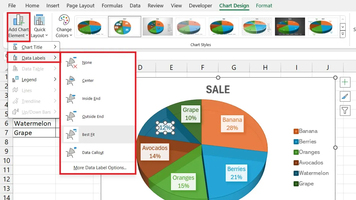
- Select the data for your main pie chart in Numbers, including the primary categories. Insert a pie chart as usual; you should see the main pie with slices representing your main categories.
- Identify the slice you want to break down into subcategories. Prepare a linked table or a separate range in your spreadsheet that lists these subcategories and their corresponding values.
- Add a second pie chart beside the main pie chart. Use the linked table or grouped data as the source for this secondary pie. This pie will show the detailed breakdown of the selected slice.
- Adjust the colors in both pies to match related categories—use the same color for the main slice and its sub-slices to make the connection clear. Change slice labels to show names and percentages for clarity.
- Position the secondary pie close to the main pie slice it elaborates on, so viewers immediately understand the relationship. You can add a text box or arrow to emphasize the linkage if needed.
For example, a simple pie chart might show "Fruit" as 40% of sales. A pie of pie chart breaks "Fruit" into apples, oranges, and bananas in the secondary pie, revealing their individual shares. This method makes complex data easier to understand without cluttering the main chart.
How to calculate a pie chart: understanding the math behind the slices
Each slice in a pie chart corresponds to a portion of the total data, represented as an angle in degrees. To find the angle for any slice, you use the formula: (value ÷ total) × 360 degrees = slice angle. This ensures that all slices together complete the full 360-degree circle.
Follow these steps to calculate slice angles using a sample dataset with four categories: A = 30, B = 45, C = 15, and D = 60.
- Calculate the total sum of values: 30 + 45 + 15 + 60 = 150. You should see the total value, 150, which represents the whole dataset.
- For category A, divide its value by the total: 30 ÷ 150 = 0.2. This shows category A makes up 20% of the whole.
- Multiply the result by 360 to find the slice angle for A: 0.2 × 360 = 72 degrees. The angle 72 degrees represents category A's slice in the pie chart.
- Repeat steps 2 and 3 for categories B, C, and D:
- B: (45 ÷ 150) × 360 = 108 degrees
- C: (15 ÷ 150) × 360 = 36 degrees
- D: (60 ÷ 150) × 360 = 144 degrees
- Check that the sum of all slice angles equals 360 degrees: 72 + 108 + 36 + 144 = 360. If it does, your data and calculations are consistent.
Accurate totals and consistent data are essential because any mismatch can distort slice sizes. This math ensures each slice visually communicates its proportion of the whole clearly in your pie chart.
How to put a pie chart in your document or presentation
Once your pie chart is ready in Numbers, you can easily transfer it to other apps like Pages or Keynote to enhance your documents or presentations. The most straightforward method is copying and pasting the chart, which keeps it editable and preserves its quality.
- Select the pie chart in Numbers by clicking on it. You should see a blue selection border around the chart.
- Press Command + C to copy the chart.
- Open your Pages or Keynote document and click where you want the chart to appear.
- Press Command + V to paste. The chart will appear in your document, maintaining its original formatting and allowing you to resize it freely.
- Adjust the size by dragging the handles on the chart edges. Hold Shift while dragging to keep proportions intact, ensuring the chart remains clear and not distorted.
If you prefer to export the pie chart as an image or PDF for embedding, use File > Export To > PDF or File > Export To > Images in Numbers. Choose a high resolution (at least 300 dpi) for clear display in presentations.
When embedding exported images, insert them via the Insert > Choose menu in Pages or Keynote. Avoid excessive resizing after insertion to maintain sharpness. For presentations, test your slides on the actual display device to confirm the chart is legible and visually balanced.
How to do pie charts in maths: using Numbers to visualize math problems
Using pie charts in Numbers can clarify many math concepts by turning abstract numbers into visual stories. Start by setting up your data to reflect fractions or percentages accurately. For example, if you have a problem about the probability of events, input the likelihood of each event as a percentage or fraction converted to a decimal, ensuring the total sums to 100% or 1.
Pie charts are useful for representing ratios, probability distributions, and data segmentation. Label each slice clearly with both the category name and its value or percentage to make the chart informative for math explanations. Adding a legend or direct data labels helps avoid confusion when presenting to students or peers.
Consider this example: "In a bag of 20 marbles, 5 are red, 7 are blue, and 8 are green. What fraction of the marbles is each color?" Enter the counts for each color, then create a pie chart. The chart will show slices of 25%, 35%, and 40%, visually demonstrating the fractions 5/20, 7/20, and 8/20 respectively.
- Open a new Numbers sheet and enter your categories (e.g., Marble Colors) in one column.
- Next to each category, enter the numeric values (e.g., number of marbles).
- Select the data range, then click the Chart button and choose Pie Chart.
- Numbers displays the pie chart with slices proportional to your data. Add data labels by selecting the chart, clicking the Format sidebar, then ticking "Show Value" under Labels.
- Use the chart title and legend to explain what the chart represents, such as "Marble Color Distribution" showing fractions visually.
This method supports visual learners by bridging numbers and geometry. Annotated screenshots showing each step help verify you have set up the data and labels correctly, making math problems easier to interpret and communicate.
Troubleshooting common issues when making pie charts in Numbers
When pie chart slices don’t add up to 100%, the most frequent cause is data entry errors or hidden decimal places. Check your data table to ensure all numeric values are correctly entered and that percentages total exactly 100%. If your values are raw counts, verify the sum matches the expected total before creating the chart.

If Numbers shows missing or non-numeric data errors, it usually means some cells contain text or are blank where numbers are expected. Replace any non-numeric entries with valid numbers or zero if appropriate. You can use the "Find & Replace" feature to quickly locate problematic cells.
Charts with many slices can become cluttered and hard to read. To improve clarity, consider grouping smaller categories into an "Other" slice or use the "Pie of Pie" chart type for detailed breakdowns. Adjust slice labels for font size and position to avoid overlap.
When chart customization options are missing, verify that the chart is selected by clicking on it once. If options remain unavailable, restart Numbers or update it to the latest version. Sometimes, chart styles or formatting panes are hidden and can be revealed via the sidebar toggle button in the toolbar.
- Verify your data sums to 100% or the correct total. You should see all values highlighted and a sum displayed at the bottom of the Numbers window.
- Check all data cells for non-numeric entries by selecting the column and using "Edit" > "Find" to locate text. Correct or remove these entries. The error message should disappear.
- Reduce clutter by combining minor categories: select small slices in your data, sum their values into one cell labeled "Other," then update the chart. The pie chart will show fewer, clearer slices.
- Click once on the pie chart to ensure it’s active. The right sidebar should display chart options. If not, click the sidebar icon in the toolbar. Customization controls should now appear.
Frequently asked questions
How to make pie chart in excel with numbers?
To make a pie chart in Excel using numbers, first enter your data with categories in one column and their corresponding values in the adjacent column. Select the data range, then go to the Insert tab and click on the Pie Chart icon. Choose the style you want, and Excel will generate the chart based on your values. You can customize the chart by clicking on it and using the Chart Tools that appear.
How to create pie of pie chart?
In Numbers, to create a pie of pie chart, start by selecting your data as you would for a standard pie chart. Then, choose the Pie Chart option and look for the “Pie of Pie” style, which breaks out smaller slices into a secondary pie. This helps in visualizing smaller categories more clearly. Adjust the threshold for which slices appear in the secondary pie to suit your data.
How to put pie chart?
To put a pie chart into your document or presentation, first create the chart in Numbers. Then, select the chart and copy it using Command + C. Open your document or presentation app, and paste it using Command + V. The chart will appear as an image that you can resize and position as needed.
How to figure out pie charts?
Figuring out pie charts involves understanding that each slice represents a portion of the whole, calculated as a percentage of the total sum of all data points. To interpret a pie chart, check the size of each slice relative to the circle, which corresponds to its value. Knowing the total and individual values helps you understand the data distribution visually.
How to make a pie chart in numbers mac?
On a Mac using Numbers, enter your data in a table with categories and values. Select the data, then click the Chart button in the toolbar and choose Pie Chart. Numbers will insert the chart based on your selection. You can customize colors, labels, and slice order using the Format sidebar to make the chart clear and effective.
Honest Limits
This guide focuses on creating pie charts within Numbers and does not cover advanced statistical chart types or integration with external data analysis tools. Pie charts are best suited for displaying simple proportional data where each slice represents a part of a whole. If you are working with complex datasets, multiple variables, or need to compare data trends over time, other chart types like bar graphs, line charts, or scatter plots may provide clearer insights.
Next Step
To deepen your skills, try creating a pie of pie chart in Numbers by grouping smaller slices into a secondary pie. This technique helps when you have many categories and want to highlight details without cluttering your main pie chart. Experiment with the Chart sidebar options to customize colors, labels, and slice order to make your data visually compelling and easy to interpret.
See also: How to Create a Pivot Table in Numbers: A Clear Step-by-Step Guide · How to Use VLOOKUP in Numbers: A Step-by-Step Guide for Numbers Users