How to Create a Pivot Table in Numbers: A Clear Step-by-Step Guide
This guide shows you how to create a pivot table in Numbers, helping you organize and analyze your data efficiently on Mac or iPad.
You have a table full of sales data on your Mac or iPad, but making sense of it can feel overwhelming. You want to summarize and analyze this information quickly without switching to another app.
This article guides you through how to create a pivot table in Numbers, Apple's spreadsheet app, so you can easily organize and explore your data. You'll learn step-by-step how to select your data, build the pivot table, arrange rows, columns, and values, and customize the view to fit your needs. Along the way, we’ll also highlight some limitations in Numbers compared to Excel, helping you decide if it meets your requirements.
Key takeaways
- Prepare your data with clear headers and consistent formatting before creating a pivot table.
- Use the Organize sidebar to create a pivot table from your selected table in Numbers.
- Add fields to Rows, Columns, and Values areas to summarize data effectively.
- Apply filters and sorting directly within the pivot table for focused analysis.
- Refresh your pivot table manually after updating the source data to keep it current.
Before you start: Prepare your data and understand Numbers’ capabilities
Before creating a pivot table in Numbers, make sure your data is organized in a clean table format with clear headers for each column. Consistent data types within each column are crucial; mixing text and numbers in the same column can lead to unexpected results or errors. A pivot table helps you summarize and analyze large data sets by grouping, sorting, and calculating subtotals quickly, turning raw data into meaningful insights.
Numbers offers a streamlined pivot table experience tailored for Mac and iPad users but does not include some advanced features found in Excel, such as calculated fields, multiple consolidation ranges, or more complex data model integrations. Understanding these differences helps set realistic expectations about what you can achieve with Numbers.
Below is a comparison of key pivot table features between Numbers and Excel, along with examples of well-prepared versus poorly prepared data tables to guide your setup.
| Feature | Numbers | Excel |
|---|---|---|
| Basic grouping and summarizing | Yes | Yes |
| Calculated fields | No | Yes |
| Multiple consolidation ranges | No | Yes |
| Refresh pivot table automatically | Manual refresh needed | Automatic refresh available |
Well-prepared data table: Each column has a header, data types are consistent (e.g., dates in one column, numbers in another), and no empty rows or columns interrupt the data range.
Poorly prepared data table: Missing headers, mixed data types within columns, blank rows or columns breaking the table structure, or merged cells that interfere with pivot table creation.
- Check your table to confirm that every column has a descriptive header. You should see clear, single-line headers at the top of your table.
- Verify that each column contains consistent data types, such as all dates or all numbers. Mixed types will cause issues when summarizing.
- Remove any blank rows or columns within your data to ensure the pivot table captures the entire range without gaps.
- Avoid merged cells in your data range, as these prevent Numbers from interpreting the table correctly.
- Understand that pivot tables in Numbers will summarize your data but lack some advanced customization options available in Excel, so plan your analysis accordingly.
Open your Numbers document and select the data table
- Launch the Numbers app on your Mac or iPad. On a Mac, click the Numbers icon in your Dock or open it from the Applications folder. On an iPad, tap the Numbers app on your Home screen.
- Open the document containing your data by selecting it from the Recents list or browsing your files. When the document opens, you will see your spreadsheet with one or more sheets.
- Locate the table with the data you want to summarize. Tables in Numbers are distinct rectangular blocks with rows and columns displayed on the sheet. Ensure the table is on the current sheet or accessible within the document.
- Select your data range. To include the entire table, click the small circle at the top-left corner of the table on a Mac, or tap and hold that corner on iPad until the entire table is highlighted. Alternatively, click and drag or tap and drag to select specific rows and columns if you only want part of the data in your pivot table.
- Confirm your selection. The selected cells will be highlighted with a border. This selection will act as the data source for your pivot table when you create it.
Note: Make sure your selection does not include empty rows or columns that could interfere with the pivot table's summary.
Create a pivot table from your selected data
- On Mac, with your data table selected, go to the menu bar and click Organize. Then choose Pivot Table from the dropdown menu. On iPad, tap the Format button (paintbrush icon), then tap Organize, and select Create Pivot Table.
- After selecting the pivot table option, a dialog box will appear prompting you to name your pivot table. Enter a descriptive name that helps you identify its purpose later, such as “Sales Summary.”
- Next, choose where to place the pivot table. You can create it on a new sheet or on the current sheet. Selecting a new sheet keeps your workspace organized, especially with large datasets.
- Once you confirm placement, Numbers generates an initial pivot table layout. This usually includes your data fields arranged in default rows and columns based on the first columns of your source table, with summary values displayed below.
- Note the interface differences: on Mac, pivot table creation is more menu-driven, while on iPad it is accessed via the Format sidebar. However, the resulting pivot table and options remain consistent across devices.
Refer to the accompanying step-by-step screenshots and short video clips for visual guidance on creating pivot tables both on Mac and iPad, ensuring you can follow the process comfortably regardless of your device.
Add and arrange fields: rows, columns, and values
Fields represent the columns from your original data table. They are the categories or numerical values you want to analyze in your pivot table. For example, if your data includes "Region," "Product Category," and "Sales," each of these is a field you can add to different parts of the pivot table to organize and summarize your data effectively.
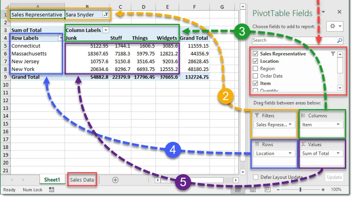
- Locate the field list panel beside your pivot table. This panel displays all available fields from your source data.
- Drag a categorical field, such as "Region," into the Rows section. You should see the pivot table update, grouping data by each region.
- Drag another categorical field like "Product Category" into the Columns section. The table will now organize data across product categories within each region.
- Drag a numerical field, for example, "Sales," into the Values section. By default, Numbers sums the sales figures, showing total sales per region and category.
- To change the summary function, click the field in the Values section and choose from options like Sum, Count, or Average. For instance, adding "Sales" twice lets you display both total sales and the number of sales entries.
- Rearrange fields by dragging them within Rows or Columns to change the data perspective. For example, swapping "Product Category" to Rows and "Region" to Columns offers a different view of sales distribution.
Using these steps, you can build a pivot table that summarizes sales data by region and product category, showing both sums and counts where needed. This flexibility helps you explore your data from multiple angles.
Filter and sort your pivot table data
Refining your pivot table results with filters and sorting helps you focus on the most relevant data. In Numbers, you can apply filters to include or exclude specific entries, such as sales from a particular quarter or a product line, sharpening your analysis.
- Select your pivot table and click the pivot table sidebar to open its settings. You should see options for "Filters" and "Sort".
- To add a filter, click the "+" button under the Filters section. Choose the field you want to filter, for example, "Quarter" or "Product Line."
- Select the filter condition, such as "is" or "is not," then pick the value(s) to include or exclude. For example, select only "Q2" to display sales data from the second quarter.
- Once applied, your pivot table updates to show only rows matching the filter, reducing clutter and focusing your view.
- To sort rows or columns, click "Sort" in the sidebar, then select the field to sort by and choose ascending or descending order.
- For example, sort by "Sales Amount" descending to highlight top-performing regions at the top.
- Combine filters with your existing row and column field arrangements to analyze specific subsets with clear organization.
Before filtering, your pivot table might display sales across all quarters and products. After applying a filter for "Q2" and sorting by sales descending, you see only second-quarter sales prioritized by highest amounts. This targeted view helps you quickly interpret key information.
Customize pivot table formatting and appearance
Making your pivot table visually clear helps you interpret data quickly and accurately. Start by selecting any cell within your pivot table, then use the Format sidebar on Mac or the paintbrush icon on iPad. Here, you can adjust cell formats such as number styles (currency, percentage), fonts, and text alignment to suit your data presentation.
Conditional formatting is a powerful feature if you want to highlight key values automatically. For example, applying a conditional format to highlight the top 10% sales values in green makes these stand out immediately. To set this, select the cells in the values area, open the Conditional Highlighting menu, choose "Add a Rule," then select "Numbers" and "Greater Than" or "Top Percent" depending on your goal. When done correctly, the cells matching your rule will change color dynamically.
Resizing columns and rows improves readability, especially when data labels or numbers are truncated. Drag the column or row borders in the header area to adjust size manually, or double-click a border to auto-fit the content. Adequate spacing prevents overcrowding and makes your pivot table easier to scan.
Comparing your pivot table before and after formatting visually confirms the improvements. Notice how adjusted fonts, colors, and sizing create a clean, professional look that helps you and others grasp insights at a glance.
Update and refresh your pivot table when data changes
In Numbers, pivot tables reflect changes made to the source data automatically, so you typically do not need to manually refresh them. When you add new rows or update existing data within the original table, the pivot table recalculates and updates its summaries accordingly. However, if you add new columns or significantly restructure your source data, the pivot table may not include these changes immediately, requiring you to rebuild it or adjust the data range.
To maintain data integrity when expanding your dataset, always add new rows directly below your existing data to ensure they fall within the pivot table’s scope. If you insert columns, verify that the pivot table's data source includes them; otherwise, you will need to recreate the pivot table to integrate these new fields.
For example, if you have a sales data table and add a new month’s figures by inserting rows at the bottom, your pivot table will update to display the latest totals automatically. But if you add a new column for a different product category, you’ll need to create a new pivot table that includes this column to analyze its data.
Troubleshoot common pivot table issues in Numbers
If your pivot table doesn’t display the expected data, first check that all relevant columns in your source table contain consistent and complete information. Empty cells or mixed data types in a single column can cause unexpected blank rows or missing values in the pivot table. Make sure numeric fields contain only numbers and text fields don’t have hidden spaces or formatting inconsistencies.

When you encounter error messages like "No data to display" or see blank pivot table cells, verify that your filters are not too restrictive. Reset filters to include all data and then gradually reapply them to isolate the problem. Also, remember that Numbers updates pivot tables automatically but does not handle structural changes well, such as adding new columns to the source data; in such cases, recreating the pivot table may be necessary.
Numbers’ pivot table functionality is simpler compared to Excel’s and lacks some advanced features like calculated fields or multiple value aggregations. If you need complex data modeling or more dynamic interactivity, consider using Excel or dedicated BI tools. Pivot tables in Numbers work best for straightforward summarizations and quick data insights.
Export or share your pivot table results
Once your pivot table in Numbers summarizes your data effectively, you may want to share these insights with others or include them in reports or presentations. Numbers offers multiple options to export or copy your pivot table, each suited to different needs.
Exporting your pivot table
- Click File in the menu bar, then select Export To and choose PDF. This creates a fixed-layout document preserving the pivot table’s appearance, ideal for sharing read-only reports.
- Alternatively, choose Export To and then Excel to save the entire spreadsheet as a.xlsx file. This allows recipients to manipulate the pivot table data further but may alter some formatting.
- After selecting your export format, adjust any options such as page range or password protection, then click Next and save the file to your desired location.
Copying and embedding pivot tables
- Select the pivot table range inside Numbers, then press Command + C (Mac) or use the Edit > Copy menu.
- Paste (Command + V) the copied pivot table into compatible applications like Pages or Keynote, where it appears as a table you can resize and format further.
- When embedding in reports, consider adding a brief description or key figures alongside the pivot table to highlight important trends or findings.
Each export method balances fidelity and flexibility. PDFs preserve layout perfectly but are static, while Excel exports allow further analysis at the cost of possible formatting shifts. Copy-pasting is quick and useful for Apple ecosystem apps but less so outside them. Choose the method that fits your audience’s needs and the level of interactivity required.
Frequently asked questions
How to create a pivot table?
To create a pivot table, start by selecting your data range in your spreadsheet. Then, access the pivot table creation tool—this is typically found under the Insert menu or a dedicated Pivot Table button. Next, choose the fields you want to summarize by adding them to rows, columns, and values areas. Finally, adjust filters and sorting to refine the data displayed.
How to make a pivot table?
Making a pivot table involves selecting your dataset and launching the pivot table feature in your spreadsheet app. After that, you'll drag and drop fields to organize data into rows, columns, and summaries. This allows you to analyze patterns and totals dynamically without altering the original data.
How to create pivot table in numbers?
In Apple Numbers, select the table containing your data. Click the Organize sidebar, then choose the Pivot Table tab and tap "Create Pivot Table." From there, add fields to Rows, Columns, and Values by tapping the plus (+) button. You can then customize filters and summary functions to suit your analysis.
How to create pivot table from data?
Ensure your data is organized in a table format with clear headers. Select the entire table, then open the pivot table tool in your spreadsheet software. Add relevant fields into the pivot areas to summarize and analyze the data effectively. Adjust filters and sorting options to focus on specific insights.
How to create a pivot table in numbers on ipad?
Open your Numbers document on iPad and tap the table with your data. Tap the paintbrush icon to open the Format menu, then select the Organize tab. Tap "Pivot Table" and then "Create Pivot Table." Add fields to Rows, Columns, and Values using the plus (+) icon, then customize filters and summaries as needed.
Understanding the Limits of Pivot Tables in Numbers
While Numbers provides a user-friendly way to create pivot tables, its functionality is more basic compared to Excel. It does not support advanced features like complex calculated fields, multiple consolidation ranges, or some types of custom aggregation. If your data analysis requires these more sophisticated tools or very large datasets, you may want to consider alternative software specialized in data analytics.
Numbers is best suited for straightforward summarizing and quick insights within Apple’s ecosystem, especially on Mac and iPad. For users needing deeper data modeling or extensive automation, exploring dedicated spreadsheet apps or database tools could be more beneficial.
To get the most out of pivot tables in Numbers, the single most useful next step is to practice creating pivot tables with your own datasets. Experiment by dragging different fields into rows, columns, and values, and use filters to see how your summaries change. This hands-on approach will help you become comfortable with Numbers’ interface and understand its strengths and limitations for your specific needs.
See also: How to Add a Table of Contents in Pages: A Complete Step-by-Step Guide · How to Make Two Columns in Pages: A Clear Step-by-Step Guide